
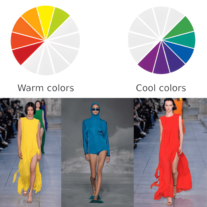
Colors are one of the most powerful tools in fashion. They can transform an outfit, highlight your personality, influence how others perceive you, and even affect your mood. Choosing the right colors in your wardrobe isn’t just about following trends—it’s about understanding how different shades complement your skin tone, body shape, and the impression you want to make. For instance, warm colors like red and orange can make you appear energetic and confident, while cooler tones like blue and green often convey calmness and sophistication. Proper use of color can elevate a simple outfit, create visual balance, and make inexpensive clothing look more luxurious. Additionally, knowing color psychology helps you dress strategically for events, work, or social occasions. By mastering how colors affect fashion choices, you can create a versatile, stylish wardrobe without overspending, mix and match pieces more effectively, and enhance your overall presence. In this blog, we’ll explore 70+ ways colors affect your fashion choices, along with realistic tips and explanations to help you build a wardrobe that is cohesive, flattering, and expressive of your personal style.
1. Understand Your Skin Undertone
Your skin undertone determines which colors enhance your natural complexion. Warm undertones look great with earthy colors like olive, mustard, and coral, while cool undertones shine in jewel tones like sapphire, emerald, and amethyst. Neutral undertones can experiment with almost any color. Choosing complementary colors enhances your natural beauty and makes your style look intentional.
2. Boost Confidence with Bold Colors
Red, fuchsia, and bright orange draw attention and exude confidence. Wearing bold colors strategically, such as in a blazer or accessories, helps you stand out without appearing overdone.
3. Use Neutral Colors as a Base
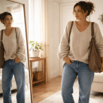
Neutral shades like black, white, beige, and gray are versatile and timeless. They act as a foundation, allowing you to add vibrant or trendy colors without clashing.
4. Understand the Psychology of Color
Colors convey emotions. Blue symbolizes calmness, yellow evokes happiness, and black exudes sophistication. Choosing colors based on psychological impact can help you communicate personality through clothing.
5. Highlight Features with Lighter Tones
Light colors like cream, pastel pink, and baby blue bring attention to areas you want to highlight, such as the upper body or face.
6. Slim with Darker Shades
Dark colors like black, navy, or deep green are slimming and can create a streamlined silhouette. Using them strategically enhances your figure without adding extra layers or structure.
7. Mix Warm and Cool Tones
Combining warm and cool shades creates balance and visual interest. Pair a cool blue top with warm camel trousers to maintain harmony in your outfit.
8. Match Colors to Occasion
Bright, vibrant colors suit casual or festive settings, while muted or neutral tones are more appropriate for work or formal occasions. Understanding this helps you dress effectively for different environments.
9. Use Color to Express Mood
Your outfit color can reflect or improve your mood. Soft pastel shades are calming, while bright hues energize you. Dressing with this in mind increases confidence and comfort.
10. Complementary Color Pairing
Using opposite colors on the color wheel, like blue and orange, creates contrast that is visually striking and stylish. Complementary colors make outfits more engaging and dynamic.
11. Monochromatic Dressing
Dressing in a single color or shades of the same hue elongates your figure and creates a sophisticated, cohesive look.
12. Avoid Overloading Colors
Too many contrasting colors can look chaotic. Limit your palette to 2–3 colors per outfit for harmony.
13. Accessorize with Color
Use scarves, belts, or shoes to introduce pops of color. Accessories allow experimentation without overhauling your wardrobe.
14. Seasonal Color Selection
Warm tones suit autumn, pastels fit spring, bright hues work in summer, and deep jewel tones excel in winter. Adjusting colors by season keeps your wardrobe fresh and stylish.
15. Pair Colors with Hair Color
Blondes often shine in cool tones like lavender or navy, brunettes look great in jewel tones, and redheads stand out in earthy colors like moss green or burnt orange.
16. Use Color for Body Proportion
Bright colors draw attention to specific body areas, while dark colors minimize them. Use strategically to balance proportions.
17. Invest in Color Basics
A wardrobe of versatile colored basics like black trousers, white shirts, and navy sweaters allows easy integration with seasonal and statement colors.
18. Coordinate with Eye Color
Colors similar to your eyes enhance your features. Green eyes pop with emerald or forest shades, and blue eyes shine in cobalt or sky tones.
19. Mix Textures with Colors
Pairing different textures in the same color adds depth. For example, a silk blue blouse with a denim blue skirt looks stylish and layered.
20. Color Blocking for Style
Use bold blocks of contrasting colors to make a statement. Pair red and cobalt blue or mustard with navy to add fashion-forward flair.
21. Avoid Colors That Clash
Some color combinations are jarring, such as neon green with bright red. Understanding which colors clash helps maintain a polished look.
22. Use White to Brighten
White reflects light and can make dull outfits appear fresher. Pair white with pastels or dark tones to create balance.
23. Black for Elegance
Black is timeless, slimming, and versatile. It works for formal events, evening wear, and casual fashion while elevating any outfit.
24. Neutral Shoes for Versatility
Beige, brown, and black shoes match most outfits and allow more freedom in choosing clothing colors.
25. Experiment with Jewel Tones
Rich shades like ruby, sapphire, and emerald add luxury to even basic outfits. They make colors stand out while remaining tasteful.
26. Combine Pastels Carefully
Soft shades like lilac, mint, or peach can create delicate, feminine outfits. Avoid mixing too many pastels at once to prevent a washed-out look.
27. Use Color for Seasonal Wardrobe Planning
Planning your wardrobe by season ensures you have cohesive color palettes, minimizing unnecessary purchases and making dressing easier.
28. Avoid Fad Colors Excessively
Trendy shades may not be flattering or long-lasting. Limit investment in fast-changing colors and focus on timeless tones.
29. Balance Bright Colors with Neutrals
Pair bright tops with neutral bottoms or vice versa to prevent overwhelming your look.
30. Color and Fabric Interaction
Fabric affects how color appears. Silk enhances brightness, while wool or cotton may soften the hue. Consider fabric when choosing shades.
31. Accessorize Monochromatic Outfits
A monochromatic look can be elevated with contrasting or metallic accessories for sophistication.
32. Use Prints Strategically
Floral, stripes, or geometric prints use color to highlight or distract. Choose prints that complement your body and skin tone.
33. Avoid Overly Dark Colors in Summer
Very dark outfits absorb heat and may feel heavy visually. Opt for lighter shades to stay cool and vibrant.
34. Color Psychology for Work
Neutral or muted tones convey professionalism. Incorporate subtle pops of color for creativity and personality.
35. Pair Complementary Accessories
Shoes, handbags, and belts in complementary colors create cohesive outfits without clashing.
36. Layer Colors for Depth
Layering different shades of the same color or complementary hues adds depth and dimension to your outfit. For example, pairing a light blue shirt under a navy cardigan creates visual interest without clashing.
37. Use Warm Colors to Energize
Colors like red, orange, and yellow draw attention and create energy. Incorporate them in tops, scarves, or shoes to make an outfit lively and confident.
38. Cool Colors for Calmness
Blues, greens, and purples are calming and soothing. These shades work well for professional settings or relaxed weekend looks.
39. Combine Neutrals Creatively
Mixing neutrals such as beige, gray, and white can produce elegant, sophisticated outfits. For instance, a beige trench coat over gray trousers with white sneakers looks polished without needing bold colors.
40. Avoid Too Many Bright Colors Together
Combining multiple bright colors can overwhelm the eye. Stick to one or two bright colors per outfit for balance.
41. Add Metallic Hints
Silver, gold, or bronze accessories or accents can complement colors and elevate a simple outfit without spending much.
42. Color for Skin Glow
Certain colors make your skin appear more radiant. Warm undertones shine in gold, peach, and coral, while cool undertones look luminous in blue, lavender, or emerald.
43. Monochrome with Different Textures
Wearing different textures in the same color keeps the look interesting. Pair cotton with leather or silk with wool to add dimension.
44. Color Placement Matters
Strategically placing brighter colors near the face draws attention upward, enhancing facial features and expressions.
45. Avoid Washing Out Your Skin
Pale colors too close to your skin tone can make you look washed out. Choose shades with enough contrast to enhance your complexion.
46. Use Color to Hide Flaws
Dark shades can conceal areas you want to minimize, while bright or light colors draw attention to areas you want to highlight.
47. Seasonal Trends Can Guide Choices
While not mandatory, seasonal color palettes (like Pantone’s “Color of the Year”) can inspire fresh outfits without overhauling your wardrobe.
48. Color Coordination in Groups
If attending a group event, coordinate colors subtly. Matching undertones or complementary colors in small ways keeps everyone looking cohesive.
49. Avoid Too Much Black in Daylight
While black is slimming and elegant, excessive black in daytime can feel heavy. Pair black with lighter tones for balance.
50. Earth Tones for Natural Vibes
Olive, camel, and rust create an earthy, grounded aesthetic. These colors are timeless and versatile for casual or professional settings.
51. Pastels for Spring & Summer
Soft pinks, blues, and lavenders create airy, refreshing looks ideal for warmer months. Pair them with neutrals for subtle sophistication.
52. Bold Colors for Statement Pieces
If you’re experimenting with color, focus bold shades on one piece (like a coat or dress) rather than the whole outfit. This makes the look modern and manageable.
53. Combine Neutral Accessories with Colorful Outfits
A colorful dress paired with neutral shoes or a bag ensures the outfit is balanced and visually appealing.
54. Color as a Tool for Height Illusion
Wearing vertical color lines or matching top and bottom shades can create the illusion of taller proportions.
55. Use Contrasts for Visual Interest
Pairing light and dark shades, like white and navy, adds depth and keeps outfits from looking flat.
56. Avoid Clashing with Prints
If wearing printed clothing, balance the color palette with solid items to prevent overwhelming the eye.
57. Use Color Psychology for Social Settings
Bright warm colors convey approachability and energy, while muted or pastel shades suggest calm and friendliness.
58. Layering Multiple Shades of One Color
Mixing light, medium, and dark shades of the same color creates a dynamic and fashionable monochrome outfit.
59. Coordinate With Jewelry Colors
Match your clothing color palette with gold, silver, or gemstone jewelry for polished and intentional styling.
60. Accessorize with Complementary Colors
Introduce contrasting color accessories to make outfits pop without being overpowering. For instance, a green bag with a red top adds vibrancy.
61. Avoid Faded or Dull Colors
Faded clothing can look worn out and cheap. Vibrant, fresh colors make outfits appear well-maintained and stylish.
62. Bright Tops With Dark Bottoms
Wearing bright-colored tops with dark bottoms draws attention to your upper body, balancing proportions and creating flattering looks.
63. Use Scarves or Hats to Add Color
Scarves, hats, and hair accessories can introduce colors subtly, allowing experimentation without committing to full outfits.
64. Colors to Reflect Personality
Choose colors that resonate with your personality—bright and bold for outgoing types, muted for calm and minimalistic styles.
65. Avoid Seasonal Color Mistakes
Wearing heavy winter tones in summer or light summer colors in winter can feel visually off. Match colors to season for harmony.
66. Pair Statement Shoes With Outfit Colors
Shoes in bold colors should either match or contrast with key outfit elements to create a coordinated look.
67. Use Subtle Shades for Work
Neutral, soft, or muted shades convey professionalism and allow occasional pops of color through accessories or scarves.
68. Layering Colors for Transitional Weather
Layering different shades of clothing (like sweaters, jackets, and scarves) helps transition from one season to another while maintaining color harmony.
69. Stick to a Personal Color Palette
Choosing a set of 6–8 personal favorite colors ensures that most wardrobe pieces mix and match easily, reducing the need for excess shopping.
70. Experiment Safely With Accessories
If unsure about bold colors, experiment through accessories first. Shoes, bags, belts, or jewelry in statement colors let you try trends without full outfit risk.
Conclusion
Colors play a vital role in fashion choices. They affect perception, mood, body proportions, and style coherence. By understanding how different shades interact with your skin tone, body shape, and personal style, you can make informed wardrobe choices. Using neutral bases, complementing colors, layering shades, and adding strategic pops of color allows you to look polished, stylish, and intentional. Implementing these 70+ tips ensures that your wardrobe is versatile, cohesive, and expressive of your personality, while helping you maximize style without overspending.